Once upon a time at the Orlando Pen Show this September I had the pleasure of chatting with Carl Fisher, the brain behind the F3 pens (not to be confused with Fisher space pens), just before I — spoiler alert — did damage to my wallet. I had used one of his pens before, a commission piece done for another pen nerd, so I wasn’t fully in the dark regarding his work when I approached his table, thank you very much. I was, however, drawn to it from the sheer blast of rainbows and clips on caps, as well as the general positivity and talent he exudes. And don’t get me started on the pen stands. Carl makes both the wooden stands and he also 3d prints the… well, the 3d printed pen stands.
It’s unfair how talented some people are.
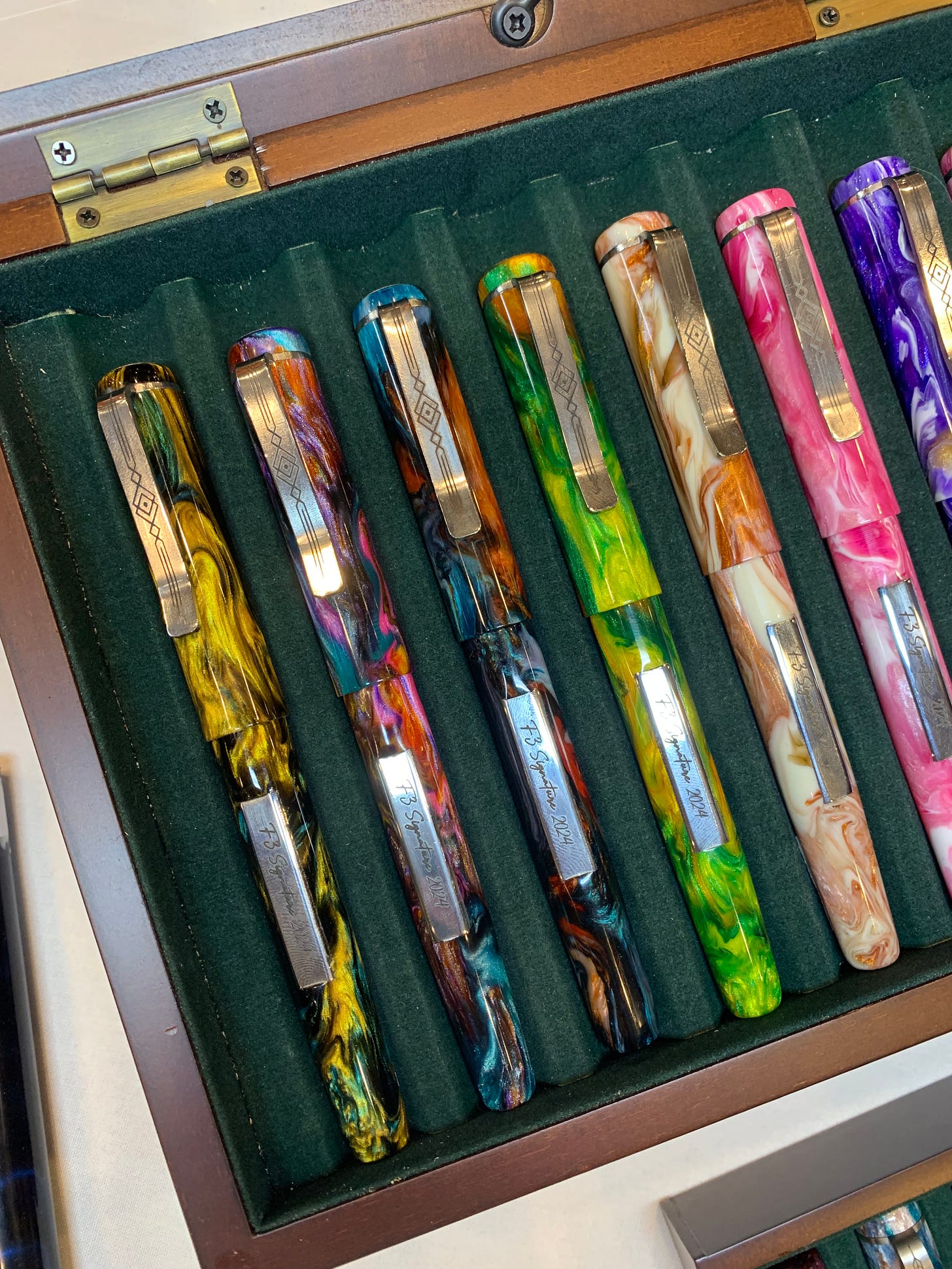
Take a look at this:
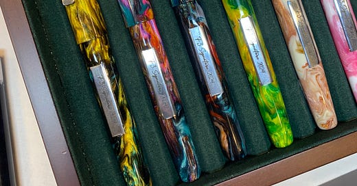
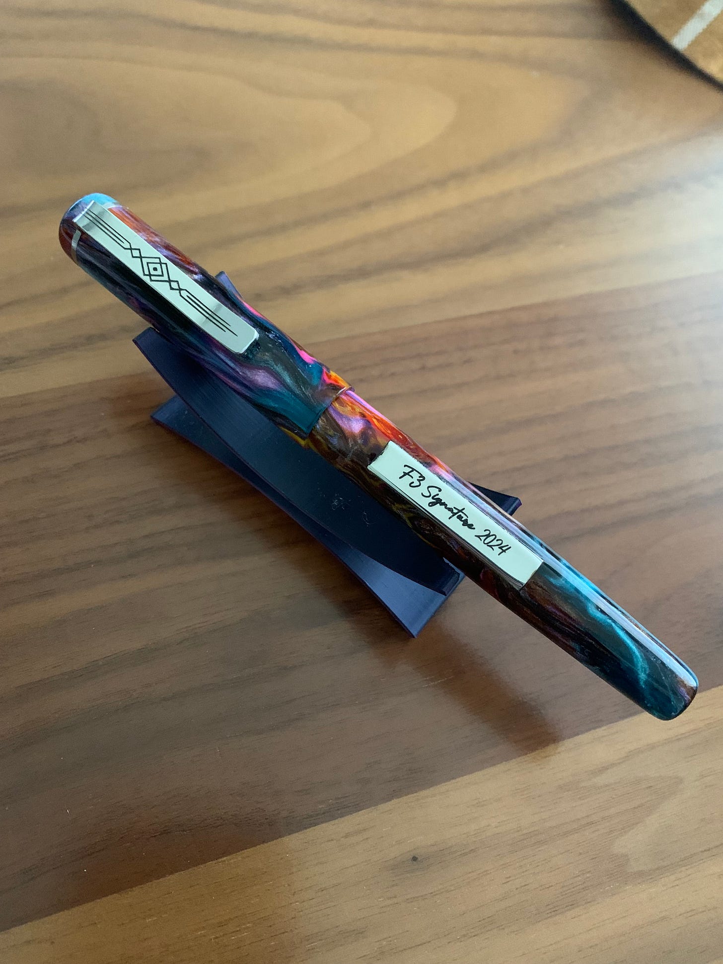
This is the first tray that grabbed my attention. Carl apparently turns several pens he calls his ‘signature’ line every year; those are slightly more expensive pens that are usually adorned with a clip and another detail which varies every year, alongside being stupidly good looking. This year, said detail was a small plaque that read ‘F3 Signature 2024’, there for you just in case you forgot the name of the model while using the pen.
I’m not saying that happens to anyone.
Definitely not me.
But, you see, the pens themselves made me drool and I forgot my own name.
Actual quote by me when I saw the Signature line.
I appreciate the fact Carl was very open about the imperfections in his pens, although they were barely noticeable; this may seem counterintuitive, but the whole interaction served to be the opposite of a deterrent for me. Honestly, I orbited around his table for so long he probably would have just given me a pen to get rid of me (or maybe called the police because this weirdo was stalking him, I don’t know).
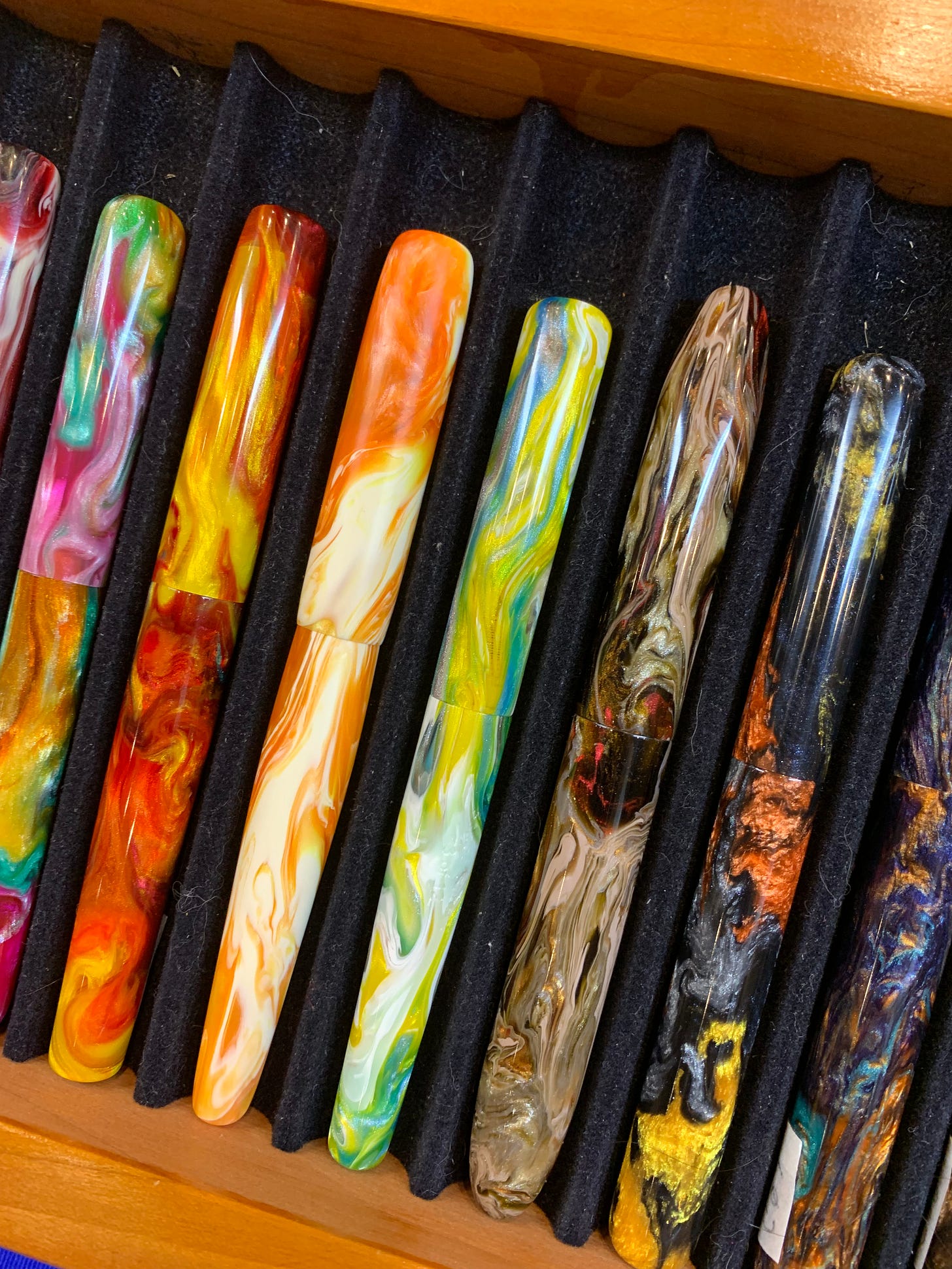
Close look at the base models and I almost got the first and the fourth and the fifth from the left. The fourth, of course, also having been made from a LE material.
On day two of the show, I finally pulled the trigger on one of the pens. It wasn’t hard to do so, generally; what was hard, however, was picking just one, which makes sense when you see the selection. So, trust me, I would’ve probably gotten two, but alas, my paycheck still doesn’t match my aspirations (I’m working on one or the other, though). What saved my wallet was also the fact I couldn’t just pick.
Anyway. The base model was significantly less expensive than the signature, and, as y’all know, I don’t care about clips — mostly dislike them on most pens except mass produced ones, of course, since I’m a simp; however, for some reason that may have been the OCD in me but also could have been witchcraft from Carl, I kept coming back to one specific Signature pen, despite the clip. Or, maybe… because of it.
The stand was free and it looks awesome under this pen.
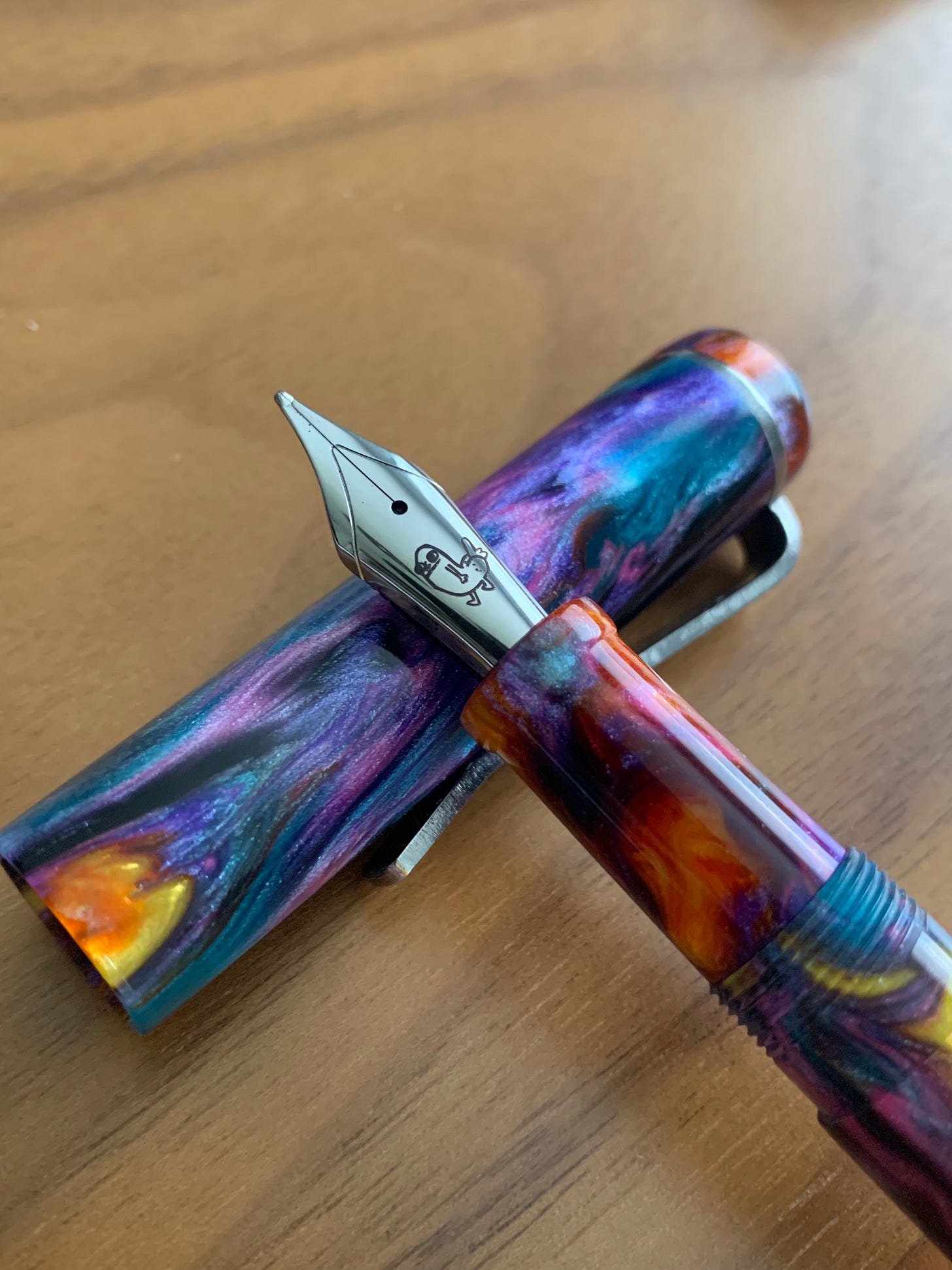
The pen that ended up coming home with me is the one pictured above; Carl was gracious enough to send me off with a 3D printed pen stand and a keychain and a pen sleeve which, of course, I chucked in my bag because I kept playing with my new acquisition. I was also able to get a cool ass nib to go with it. There was nothing wrong with the original nib — Carl laser engraves his nibs and makes sure they’re good to go immediately — but I wanted more.
And then I got a grind on it, of course. But I’ll get back to that.
The pen itself is a work of art with flaws that make me love it even more. The finish is subtly sparkly, which I appreciate; the clip is massive, but doesn’t make the pen weigh too much, just gives it the heft it deserves. The precision of the laser engraving, the thought behind the design, and the overall feel of the pen really worked for me. The pen itself reminds me of a galaxy.
Side note, I recently found out that the universe is not all that colorful as I had thought, but I refuse to believe that.
The cap features that super massive black hole clip that just slaps, and, sure, it makes the whole thing weigh more than you’d potentially want, but have you ever seen a Homo Sapiens? That’s hefty. This clip works well, and it’s functional, with enough give for me to stick it in my jeans or jacket pocket and have the pen peek out into the world.
My work Zoom chat also liked the pen. I don’t remember them commenting more on most other pens, unless they’re more colorful.
The pen has rounded ends which is, at this point, probably my favorite shape. I don’t want too many angles on my pens. Except when I can prop the pen vertically on my desk and pretend it’s a tower for some reason.
There’s a slight dip in the grip that allows for your thumb and index finger to enjoy the pen as much as your eyes do, and a stop at the edge so you won’t end up gripping the feed — not sure that anyone does that ever, but now you can rest assured it won’t happen either way. The plaque is positioned in such a way it doesn’t throw off the balance, which was my concern when I first saw the pen. As for the plaque itself, it does feel slightly unfinished/not flush, but that’s not a flaw I care much about, and I was warned about it anyway. It’s not even visually unappealing; I can just feel it because I keep thumbing the thing like the OCD maniac that I am.
The pen takes a Jowo threaded, #6 nib, and a — surprise! — threaded Schmidt converter. I will admit I am not a fan of threaded converters as I’ve only had issues with them leaking in one pen before, but this time I cannot complain as everything works as intended. I just need to remember not to yank the converter out when I refill the pen again and again. I’ve kept it inked since September, thank you very much, and the ink looks pretty great in it (Birmingham Pens Magnolia Mirage). I mean, there was probably some other, darker ink, in that nib before I inked the pen, so it’s more purpley than pink, but that works well for me too.
The pen is also pretty big, bigger than, say, a Homo Sapiens, and if it were just half a centimeter longer, it would’ve been unusable to me. Thankfully, it’s the perfect length for my weird fingers.
Back to the grind.
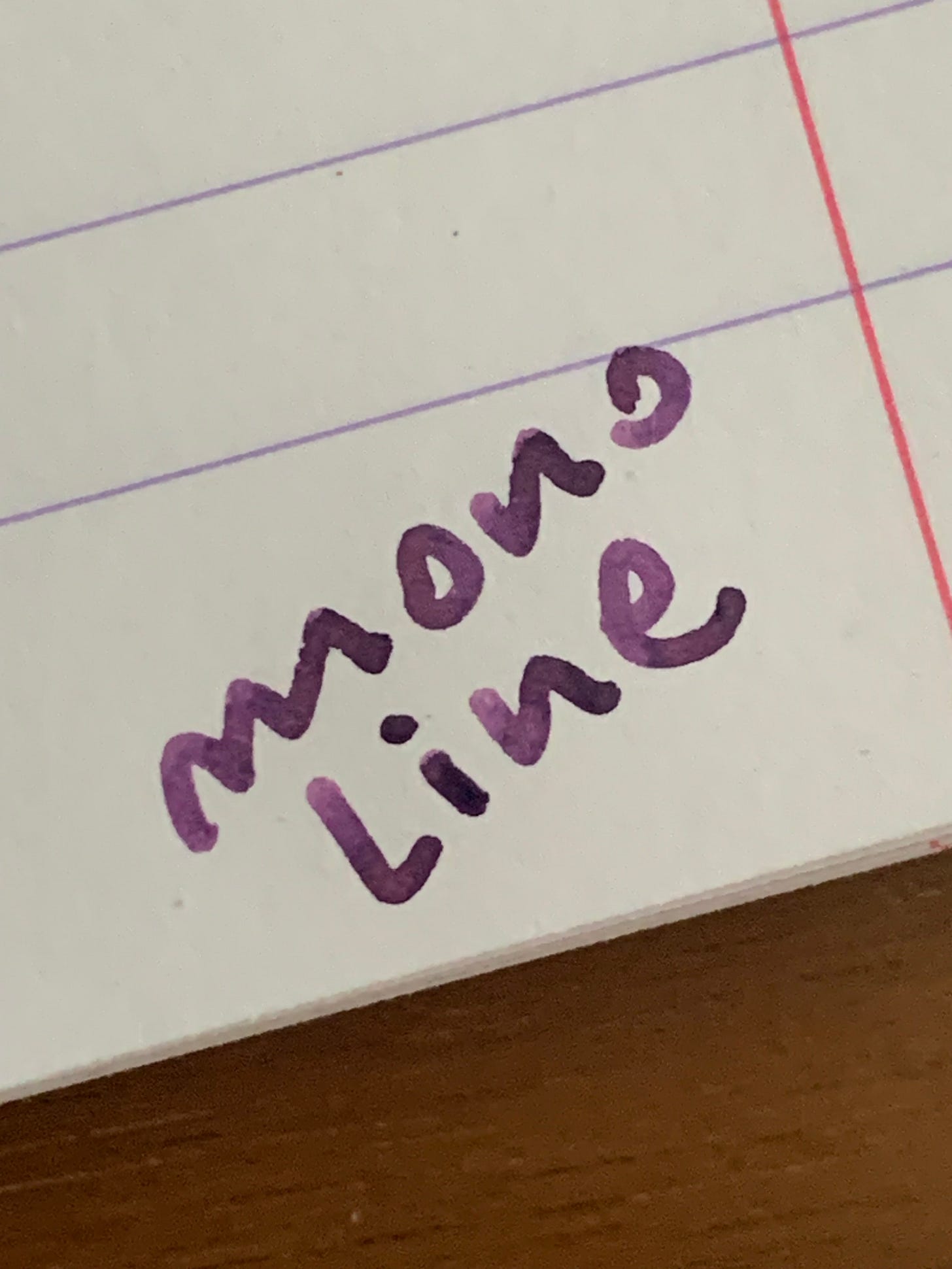
I had a broad with a funny engraving installed because I’m a teenager at heart, and then I went over to Kirk Speer to have him do his magic. I ended up with a monoline grind because… I wanted more of those… round… grinds… After a while, I realized just how fun this grind is, and as I said, I haven’t changed inks since.
The very appropriate engraving because I am, in fact, 15.
The writing sample is below, and pardon the zoom, but that shading leaves me breathless.
So, what do I like about the pen and what do I dislike about it?
Plenty to like. The fit and finish, the depth of colors, the sparkles, the heft, the size. The fact I can put in funny nibs in. The sturdy clip (yes, fine, I like clips, sue me). I think this model is a great choice if you were to venture into F3 Pens; I also think you wouldn’t make a mistake if you went with a base model, if you prefer your pens smaller and lighter and clipless.
I’m gonna go with “I don’t like that small imperfection that Carl told me about regarding the plaque” because I have to respond to my own question, but that’s about it. I really don’t have many complaints. I know it takes a lot of time, money, and effort to make a pen, so I won’t comment on the price because, again, no one forced my hand there either.
(And I thought the price was fair).
All in all, I like this pen; I may go for a base model sometime in the future just to get to talk pens with the maker.
To end this post on a more negative note, I may have to slow down with pen acquisitions for a while. Sorry to disappoint; I don’t want to get too personal but it seems like it’s time to hit the pause button on some of the things going on in life.
Anyway! Please let me know in the comments if you’ve ever bought a pen that features something you swear you hate but end up loving it.



omg I want a dickbutt nib too! new goal for 2025.
Dickbutt? Really? You're outrageous.