I went to my old book club meeting last night (Fantasy and SF fans weeeeee) and the topic, of course, wasn’t D&D, but during the meeting, I found out another awesome reviewer (check them out,
) called my blog chaotic, and that made my cold, dead heart warm. Naturally, I started thinking about alignment charts, but when I went to jot my thoughts down, I realized I had left my pens at home (gasp), as it was quite cold and I didn’t want them to freeze. But the idea was born!(Not that not having pens makes me think about pens. Everything does.)
I don’t usually pick pens according to any reason or logic, except when I absolutely need a feature I can get only from a particular pen (think click mechanism/quickdraw). I am very well known to frivolously and impulsively obtain pens. Doesn’t that sound like your typical D&D session where you get absolute madness, as strategy is way less important than in MOBAs, because it’s all about fun?
But before we venture into classes or races, we ought to set some ground rules, and also, we should probably figure out who we’re dealing with. And what better way to totally put pens in particular boxes (no pun intended) but to use a fully arbitrary alignment chart? Of course, I also set some ground rules, otherwise this post will get too broad and long winded, and I am trying to avoid that. Today at least; can’t really promise anything for the next post.
The rules:
Rule 1: pens that I own. Can’t be saying bad things about pens I’ve never used (although Visconti quality control just begs for that).
Rule 2: gold nib pens only. I do have my own ideas on steel nibbed ones too, but hey, content ain’t gonna write itself.
Rule 3: we do not speak about pen charts.
Rule 4: the opinions are my own, and I strongly leaned towards feelings on the pens as opposed to actual, you know, moral value of them. Because they’re pens. They don’t think in those terms. I do, however, because I can also be found on that chart.
But you’ll have to guess where I lie.
I present to you…
The Fountain Pen Alignment Chart by
Now you’ll probably disagree with some of these, if not most of them, and if so, kindly write about your own gold nibbed pens and your own experience and feelings on them, thank you very much.
Starting with the Good pens, let’s go with —
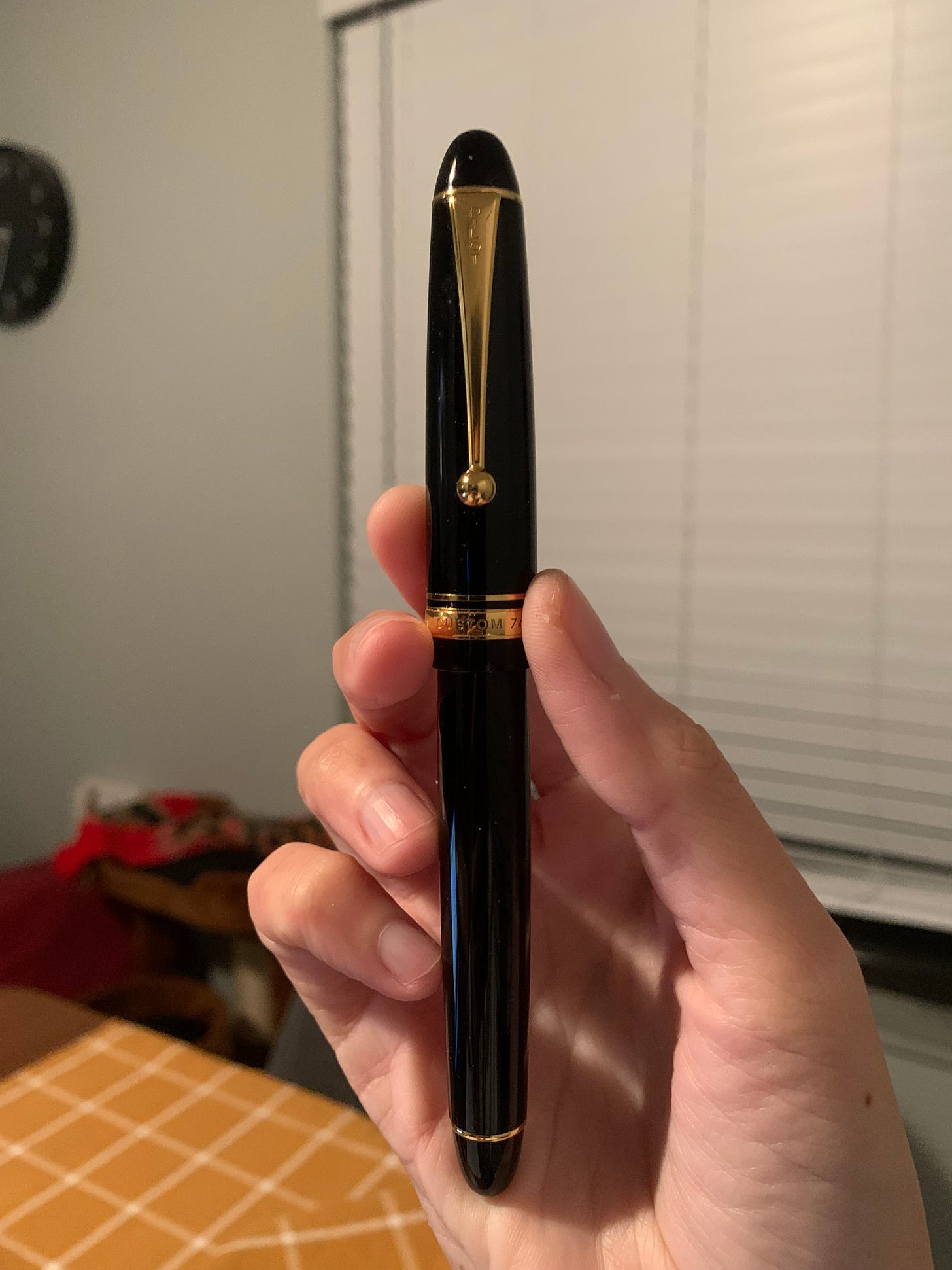
Lawful Good: Pilot Custom 91
For me, good pens are reliable, if not slightly on the boring side, but that’s also debatable. Sometimes you need something familiar that some people might call boring in your life. It’s like me on Friday nights — you won’t catch me dead in a club, restaurant, even a bar. I’ll be home, wondering if I really need health insurance and a regular paycheck after yet another long day of working with clients.
Lawful Good would be the pen that you know you can rely on, that’s consistent, unobtrusive, and not finicky. You pick it up, uncap it, and start writing. So — Pilot Custom 91 in black and rhodium, or, for those of you who prefer round ends, Custom 74. I didn’t pick the latter because mine isn’t black and boring, but “transparent wine” or whatever they called it (I call it maroon).
Bonus points if you use a medium nib or something equally uninspiring.
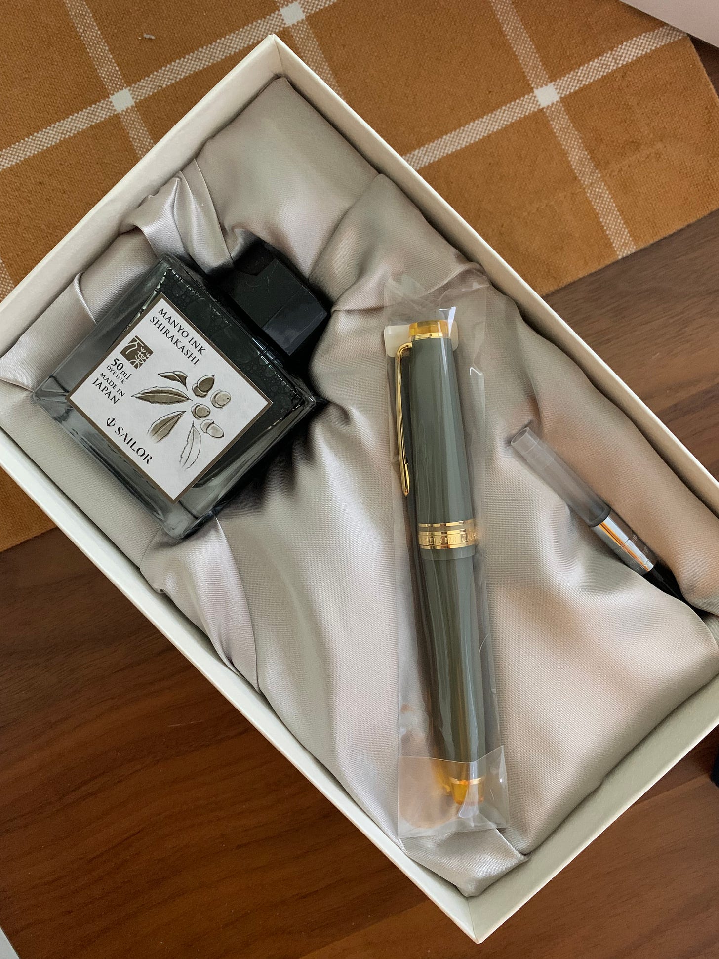
Neutral Good: Sailor Promenade
Same thing goes for the neutral that went for the good — you need a reliable pen, but not everyone will go for the most basic goods. Sometimes you need something to spice things up. Why’s this one neutral? Because it doesn’t care about being perfectly buttery smooth and obedient; because it will make people wonder if the pen is scratchy or too dry or is it the ink or the user or what the heck is this pen why won’t it write how I want it to write. And why is it slightly smaller than what I actually wanted.
Of course, we’re still in Black Rhodium trims because those types of pens look classy. Bonus points for the most common Sailor nib choice — (H)MF.
Chaotic Good: Sailor Pro Gear Slim — Nuts
Now you’ll roast me or close this tab because what sort of a nut job1 calls any fancy pen chaotic —
Oh. You meant the good pen with the amazing 14k nib that you can also find on sub $100 pens (grey market, of course) now getting sold for over $300 because of the NUT on the finial? If that’s not chaotic, I don’t know what is. With Sailor coming up with so many finishes in quick succession, it’s impossible to keep track of them. However, once you get one, you will most likely get another, and before you know it, you’re a Sailor fan, and lookit the little Nut or the little Wisteria or whatever else they decide to put on their finials. Honestly, what got me into PGSs was the Promenade. And as I said, it wrote dry. Utter madness.
The F nib on the Nuts, however, is one of the most amazing writers I own. It’s wet and reliable, the lines are consistent, and the color of the pen is not as outrageous as other finishes that Sailor is known for, so it could even pass in an office setting.
Told ya. Good.
Lawful Neutral: Lamy 2000
Does what it’s told, does it well, is reliable, follows the rules of German engineering where function trumps form. If Lamy 2000 was a person, it would be the accountant in your company whose name you don’t know, who’s always on time, never calls out, and when they finally retire, they get a watch and a gift card and get forgotten the following day.
How else would you describe a pen that’s been around for fifty-some years without any changes? The ink window on it seems like an afterthought, or rather, emulates the brutalist architecture of East Germany or, frankly, post World War II Balkans. The nib is barely noticeable. It’s good, even bouncy at times, which looks to me like your accountant raising the corner of their mouth upon hearing an exceptionally funny joke, and only after a couple of drinks.
True Neutral: Pilot Custom 742
If Lamy 2000 was the accountant, the PC 742 has to be the banker. Or the dentist. I cannot for the life of me think of a pen that’s less inspiring than the rounded, black and yellow gold pen with a boring little ball on the clip. If this pen could talk, it would curdle milk and put everyone to sleep.
However, if you need a pen to gift to someone who isn’t yet into pens, but has exquisite and faux expensive taste — a banker friend, if you’re a boomer because I don’t know a single millennial who works in a bank — this pen is the one. More expensive than the 91/74 models, but not as expensive than the 743/823 models, it falls smack in the middle of classy fountain pens, and is the most affordable Pilot pen with the nib that’s about the size of regular no. 6 nibs (Pilot size 10, for reference).
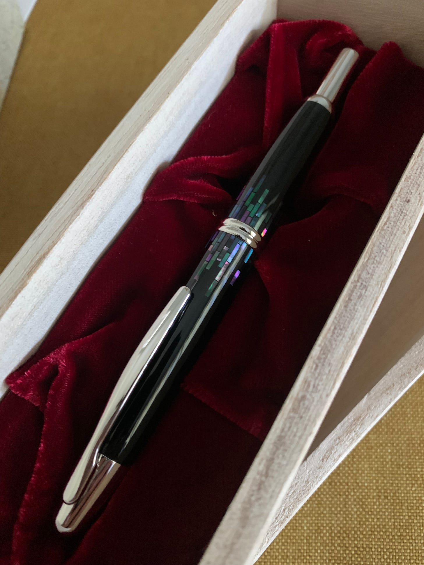
Chaotic Neutral: Pilot Vanishing Point
It’s a bird! It’s a plane! It doesn’t fly despite being called a Pilot pen (ha-ha), unless, of course, you drop it on the floor nibside down! It’s the Pilot Vanishing Point, aka Capless if you’re old.
Why chaotic? The prices are all over the place; when I bought my first one, it was $156; when I bought the Raden Stripes… well I won’t tell you, but it was three times as much for the same nib. Not the same, sorry — the first one was garbage, and at this point, I blame the ruthenium plating. But it’s not the prices that made me call this pen Chaotic.
It’s the fact it behaves like a ballpoint with it’s click mechanism, and you’ll have people ask you to borrow the pen thinking it’s just an ordinary pen, and you’ll have your inner battle and inner demons and wonder if you should risk the nib being smushed to pulp.
It’s neutral because you can get quite subdued colors, like your Matte Black. And again, Chaotic because Raden on a damned click pen.
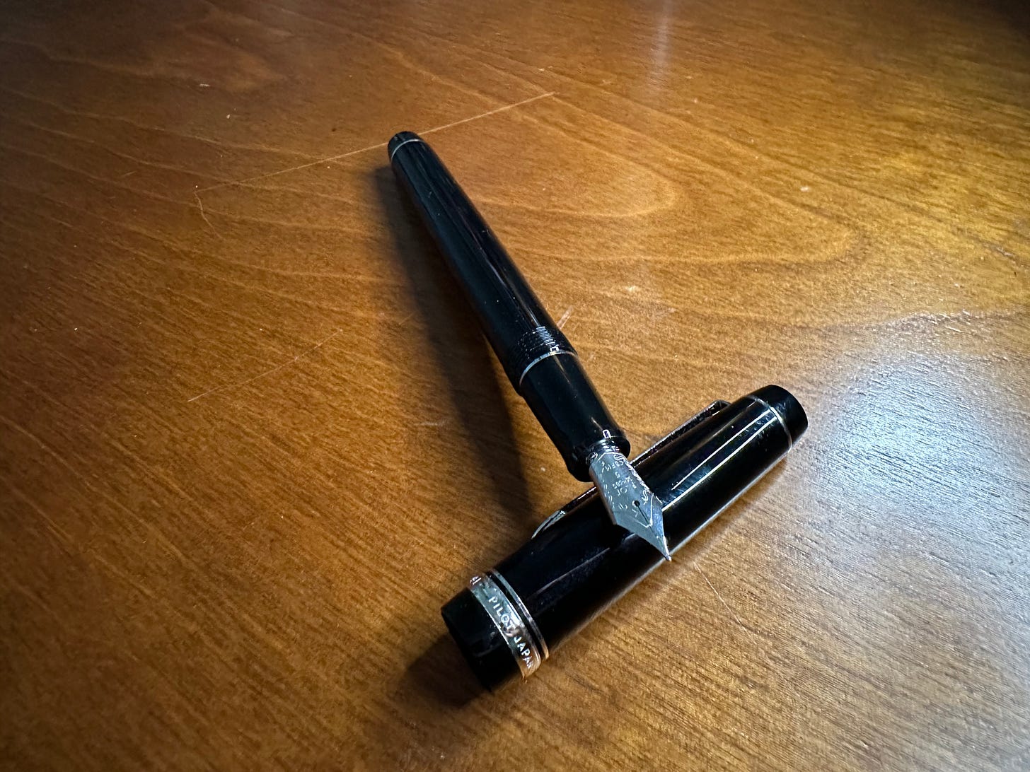
Lawful Evil: Pilot Falcon
On the outside, it seems quite ordinary and basic, but don’t be fooled by looks. When you uncap this pen, you’re faced with a nib that is supposed to look like a talon or a beak of a falcon, but I can’t tell if that’s supposed to be a joke or the designer has never seen a falcon before.
All jokes aside, it’s an attractive nib… and that’s exactly the problem. See, a lot of people will see it and hear about it and think, gee, that’s some nice flex nibbage. I should get one.
And they’ll be so utterly wrong that I almost shook this person by the front of their shirt at the Orlando Pen show when they bought the Falcon instead of the 912 with the falcon (FA) nib. The Pilot Falcon has a soft nib at best. I wouldn’t even call it that, unless you got yours second hand and it’s broken in. It’s a bouncy nib, yes, but it’s too stiff for a soft nib, at least mine is (I got it in the SF nib).
So, lawful because it follows all the nice and boring rules of how a fountain pen is supposed to look, but evil as hell because it will deceive you and laugh at you when you inevitably fail to do Spencerian calligraphy or whatever you thought you’d be able to do when you got it. Without hacking the pen, you have your bird that doesn’t fly and looks good, but nothing else.
Neutral Evil: Pilot Justus 95
I’ll admit it. It’s a gimmick. You don’t need both the soft and the hard option, because when is it exactly that you’ll have the time and wherewithal to switch between them? You’ll try both, scribble a bit, tell everyone and your grandmother about how cool it is, and then ten minutes later you’ll set it on the setting you prefer and use it as any other Pilot pen with a 14k nib. Until, of course, you want to clean it, and then you’ll realize you’ll never be sure if you got rid of all the remnants of the previous ink.
The pen is black and yellow gold, has some minor differences between finishes (think net vs stripes) that are so indistinguishable that you won’t care much about which one you got and won’t have buyers remorse and wonder if you should’ve gone for the other. I do like the FM nib option, though. I wish the beginner pens would also have that nib. I also wish the FM was available in the Vanishing Point if you don’t live in Japan, but here we are.
Evil gimmicks on a boring looking pen.
Chaotic Evil: Sailor Pro Gear, specifically Angel’s Delight
This pen can go sit on a cactus. Seriously. I am so mad. When it first came out, I wasn’t into expensive and elusive limited edition pens; hell, it took me a while to even get into Sailors. And then, one Promenade and some Nuts later, I started digging and googling and saw Angel’s Delight, the cocktail themed pen that came out in 2019, so before I even paid Sailor any heed, and immediately fell in love. Was it because it was a LE? Was it because I briefly dabbled in mixology back during Covid lockdowns? Nope. It’s the colors. It’s the damned colors, and I will always fall for any pen that is even slightly maroon. I scoured eBay and r/pen_swap for months before I ended up paying $65 extra for a second hand pen with a nib that wasn’t my first choice a week before I found the perfectly preserved one in MF that I actually wanted.
And I am even more mad that I still love the M nib on this one more than 95% of my nibs in my collection. Pure evil. Pure chaos. Sailor Angel’s Delight.
I don’t even like gin, for that matter. If you ask me, gimme a Dark n Stormy2 any day of the week.
Conclusion
I feel like I portrayed these pens accurately enough as someone who’s most likely indeed chaotic in nature. I’m basically chaotic neutral, aren’t I, and coincidentally, my first grail pen was the Vanishing Point. Until, of course, I got it and then wanted the Raden Stripes. Until I got that one and then wanted the Angel’s Delight.
I’d love to hear your thoughts on this alignment chart — and where you think I’d fall. Or you. I’m curious.
Until next time! Now, if you’ll excuse me, I have a beef with a bard in half an hour, and I need to get ready.
The dad jokes are strong in this one.
Yellowish from the ginger beer, and dark brown on top from the rum, this cocktail is super good and I will pretend until the day I die that Sailor Moroccan Mint tea looks like it.


