Hot take: Van Dieman’s Prickly Pear is better than Lamy Dark Lilac
One person’s obsession is the same person’s ink review
Who am I to tell anyone that the world phenomenon, the elusive 2016 limited edition ink, the ink that sparked even more controversy in 2024 when it came back a shade different, is in fact, less interesting than a random limited edition ink most people have never even heard of? That the coveted Lamy Dark Lilac that now sells for $300 per bottle is somehow less appealing than whatever that Prickly Pear thingy is? Who am I and how dare I!
I mean, you’re reading a pen blog by someone who dips bananas in coffee. Who’s the weirdo now?
All jokes aside, I admit I never got the itch for Dark Lilac. I think I remember it coming out, but as I still lived too far from any actual happenings in the pen world, I missed out on the craze. Back in the days, I had obtained a sample of Petrol, and it was fine, and I think I still have a few drops of it, but I was not that impressed anyway. Sacrilege, I know. I have a sample of the original Dark Lilac (just got it a few weeks ago), and I bought Shin Kai and Yama Budo to mix and try to recreate it, but even if I don’t, or even if I didn’t, I don’t think I would shed too many tears. Hot take, isn’t it?
Don’t get me wrong, though; I am not immune to limited edition inks. Heck, I’m not immune to inks with cool names even if they don’t look anything like what they’re named after1. I will spend money on inks in nice bottles. I will open a new credit card to get that sparkly chroma-shading, color changing, sheening, glow in the dark, sparkly, insane ink that is supposed to be black or blue but is green2. Especially if they come in a sick bottle AND are named after literary characters3.
When Pen Chalet4 celebrated their 10 year anniversary and announced a line of special edition inks named A Decade in the Desert in collaboration with Van Dieman’s, I immediately took to their Prickly Pear. I don’t buy inks before I try them anymore. However, they offered five interesting inks — as most Van Dieman’s inks are — and Prickly Pear spoke to me in its magenta voice and mesmerizing green eyes. Before I knew it, the thing was in my cart, alongside some other goodies, and I checked out and set to wait, almost patiently, for it to arrive.
It was love at first write. I inked my trusty Sailor Stellar Black Hole, and put the 21k Fine nib to paper.
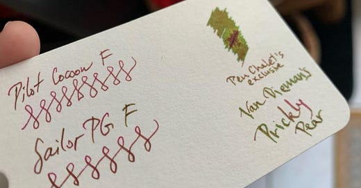
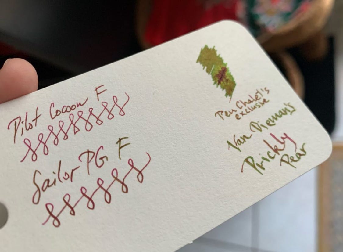
The sheen popped as soon as the ink dried. If I didn’t know better, I’d say that the color shift from dark magenta or light maroon to slick green looked like iron gall5 ink drying on the page. The stark contrast was so surprising and so satisfying, I remember taking a bad picture immediately and putting it on Instagram for the world to know. I must have reached dozens of people! Or, you know, five or six. I also remember thinking to myself that I should buy another bottle as soon as possible.
So satisfying. So. Absolutely. Divine.
What surprised me the most was the fact I got to experience the color change even on crappy paper that is my composition notebook for work, and in the Japanese fine nib. Take that, Lamy Dark Lilac. You silly goose! You have been bested.
I know some of you will ask — thinking this is an actual ink review as if I’m Mountain of Ink and not
— so I will say it here: it’s not waterproof, not permanent, if you lick your finger and touch the ink on the page, it will smear. However, it does not stain, at least not as much as one would expect from a sheener, and it is a well behaved ink that cleans out just fine from a converter. And, to draw the nail in the coffin, it’s now sold out, so all of what I said is moot.See, unfortunately for me, and at least one more person (hi if you’re reading this), this ink is unavailable, as it was a limited edition, and as of writing of this post, Pen Chalet doesn’t seem to be planning on bringing it back, which is a hecking shame. The base color is absolutely my favorite color bar none, and the strong sheen just adds character. I wish I was as cool as this ink. If this ink was a person, it would be that dude who played Superman in Man of Steel. I’m bad with names, sue me. But he’s cool. If this ink was a voice, it would be the voice of Morgan Freeman.
Being that I couldn’t go back and stock up on several bottles of this ink, I did what any sane individual would. I pestered Van Dieman’s. I pestered Pen Chalet. “Please sir, can I have some more?” The answer was, as you might have guessed, “Who are you” and “Please cease communication, otherwise we will have to resort to blocking and reporting you for harassment6”. I also scoured the internet in the futile search for at least a dupe. Sailor Kuzu isn’t the same. I’m now waiting on Diamine Robert, the Cult Pens exclusive, and hoping for a sample of Sailor Studio 931 as well. However, I know it in my heart that neither will be as great. I am aware that none of these even come in the cool little bottle with the cool little painting of a desert. Sigh.
If you’re interested in seeing the entire collection, you can do so here: https://www.vandiemansink.com/collections/a-decade-in-the-desert. If you go on Pen Chalet’s website, you’ll find two of them still available. I won’t tell you which ones. Spoiler alert: not Prickly Pear.
If you compare this ink to other relatively popular inks, I will tell you it’s less purple than Iroshizuku Yama Budo and more magentaish than, say Diamine Red Dragon. I really honestly just want someone to make a dupe of this so I can sleep easy until I find my next Moby Dick.
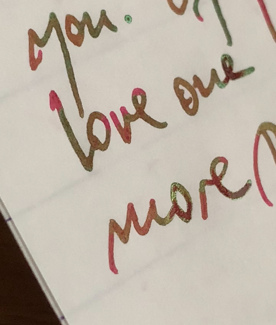
Close up of dry (love) and semi-dry (more) writing in a Sailor 21k medium nib on Tomoe River paper. Please note that the sheen is apparent on, as previously mentioned, even on crappy paper.
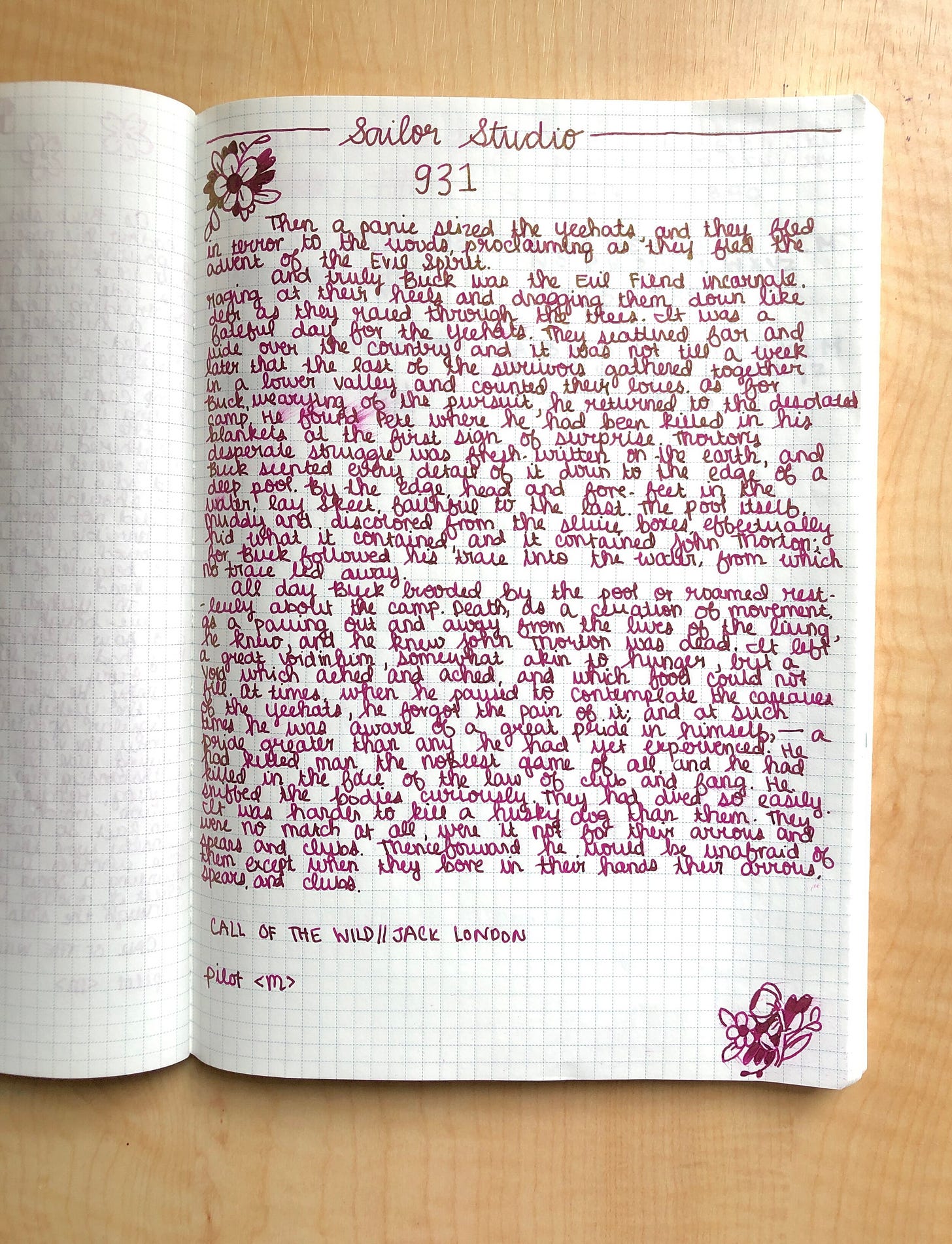
As mentioned, there are currently two inks that I am hoping could replace this beauty. One would be the Sailor Studio 931.
The pic is from Fountain Pen Pharmacist’s blog on Sailor Studio 9317
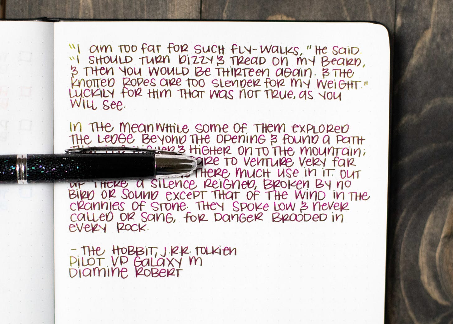
The other would be Diamine Robert, Cult Pens exclusive (of course it’s gonna be the exclusive ink).
From Mountain of Ink’s review8
There you have it. I didn’t want to be alone in my mourning after an ink not many people seem to know about, so now y’all get to be sad you can’t have it. Unless you make it and publish the recipe so I can see it.
Or, you know, you can also ask Pen Chalet to bring it back. You can let me know what you think in the super scientific poll I made below.
I may or may not share my findings with the relevant authorities.
Lemme know what’s your favorite magenta ink!
Consider subscribing to fund shipping costs of Diamine Robert to me. Or, share this post and make it known you’re a fan of bananas.
As someone who obsessed over Othello in college, of course I have Wearingeul Othello, alongside The Scottish Play (geddit), Hamlet, Romeo, and the like.
Robert Oster Black N Blue is in fact green. And I love it. I said it, I love a green ink. Wow.
I even have Noodler’s 1984. Unopened. No idea what the color is. I just had to have it.
Pen Shallot last year, Pen Sorbet this year. I should’ve gotten that sticker.
The ink is not iron gall, don’t worry.
What actually happened was that they were super nice and apologetic, of course. They also mentioned that at least one more person asked for this ink. I just cannot exist if I am not being dramatic. I love Pen Chalet with all my wallet.
You can read the whole review here: https://fountainpenpharmacist.com/blog/1994
The whole review is here: https://mountainofink.com/blog/diamine-robert



From the swatch on MOuntian of INk which is a lot like mine it does look similar but more saturated. I have just ordered Van Dieman's Ink Diluter solution and am very excited about it, so will try adding a dab to Robert when it arrives! Here is a link to it if you are interested:
https://www.vandiemansink.com.au/products/van-diemans-fountain-pen-ink-diluter-and-rehydrator
So how did Robert compare with Prickly Pear? I have Robert and it seems more saturated than the Prickly Pear swatches I have seen.