Top 10.67 inks I would recommend as the absolute expert on inks, bar none
Part one. There will be more. Also, disclaimer: expertise aside, I just really like rainbows
Once upon a time I had a pen pal. Well, I’m lying. I still write to that pen pal, although the letters are sporadic as they’s busy being cool and traveling around the world, and I am busy being anxious about not responding to their letters until, you know, a year passes (true story). We shall call them Martin for ease, and because their name is actually Martin. Anyway, Martin once used an Kyoto-no-oto ink that I hadn’t heard of at that time, and it was this beautiful dusty blurple that just caught my eye because it looked stunning on the page even if their handwriting wasn’t stunning (I’ve been told mine’s not perfect either, which is of course a lie). The ink in question was Soft Snow of Ohara, the ink whose name keeps getting autocorrected to the name of the airport, but trust me, nothing in it is transient for me.
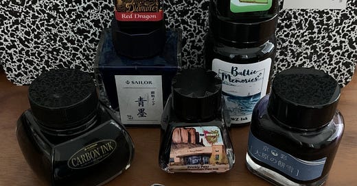
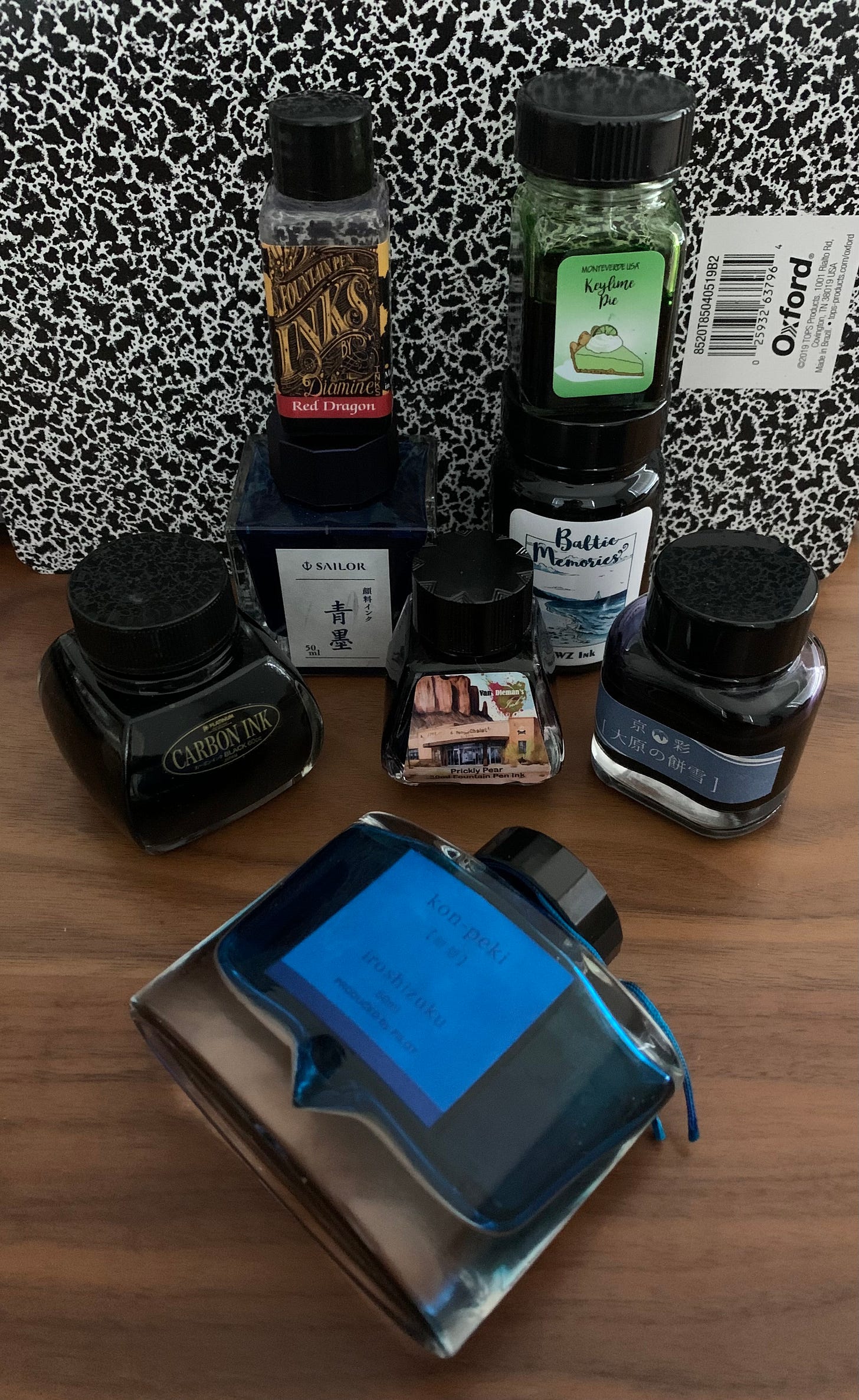
Bottles hanging out and watching me type. Kon-peki arrived with a pristine label, but I decided to move accross the ocean and use an ineffective way to transport the bottle that totally didn’t spill at all in my suitcase.
I lied in the title, of course. I’m no expert. But I do appreciate the beauty and versatility of fountain pen ink, and the prowess of various ink manufacturers — especially in the last few years. I am no Mountain of Ink1, and I will never claim to be that cool (definitely check out their blog as they’re absolutely amazing and the fact they wrote out the entire Lord of the Rings trilogy in various inks literally inspired me to start a similar, less cool project for the 30 inks 30 days challenge in September), but hey, everyone on the internet has opinions… and I am on the internet. That’s how you found out about my blog, didn’t you. I’ve always liked the way ink pools on the page, and I won’t be the first one to say that I am absolutely mesmerized by the way it dries on the page. Unless, of course, you pair Southwest Sunset (previously known as Apache Sunset) with Tomoe River paper. If you do that… you can just say goodbye to ever being able to close your notebook lest you smear and smudge all that you wrote.
Anyway, without further ado, let’s get inky.
Black ink: Platinum Carbon Black
As a European who was once told to go find a partner on the internet because I asked if the store sold converters as “I have heard about them on the internet”… I had a very limited view on black inks. Anyway, my first and only black for a long while was Pelikan Brilliant Black. It was okay. Nothing to write home about. When I moved to the US, all of a sudden, I got to explore the world of inks, and naturally, Goulet Pens website and Jet Pens website were super informative on various black inks. I was skeptical at first — black is black is black, right? — and after trying Blackstone Barrister ink (horrible, feathered like mad) and Noodler’s Black (what is drying?) and Sailor and Pilot Black (just okay), I pulled the trigger on the Platinum Carbon Black.
Heck yes.
My love of black ink(s) was born the moment I put the nib to paper. Honestly, the velvety feel of it and the subtle sheen just made me love it more. If you want character out of a black ink, seek no further. I am sure I have a sample of Noodler’s X-Feather, and perhaps even Heart of Darkness, but I am a) not too big of a fan of them, and b) why ruin perfection? Platinum recently came out with Chou Kuro, and of course you can try it, but honestly, personally, the price tag puts me off. Platinum Carbon black is a pigment based ink, so regular pen cleaning is definitely recommended, but I’m the wrong person for that. Carbon Black has been living in my Preppy for a few years now and it’s probably now impossible to evict per tenant’s rights in Florida, but that’s okay. It’s a great, waterproof ink, and it looks stellar on the page.
And once it dries, you can run water over the page and the letters will remain on it until the paper dissolves. So. Hecking. Cool.
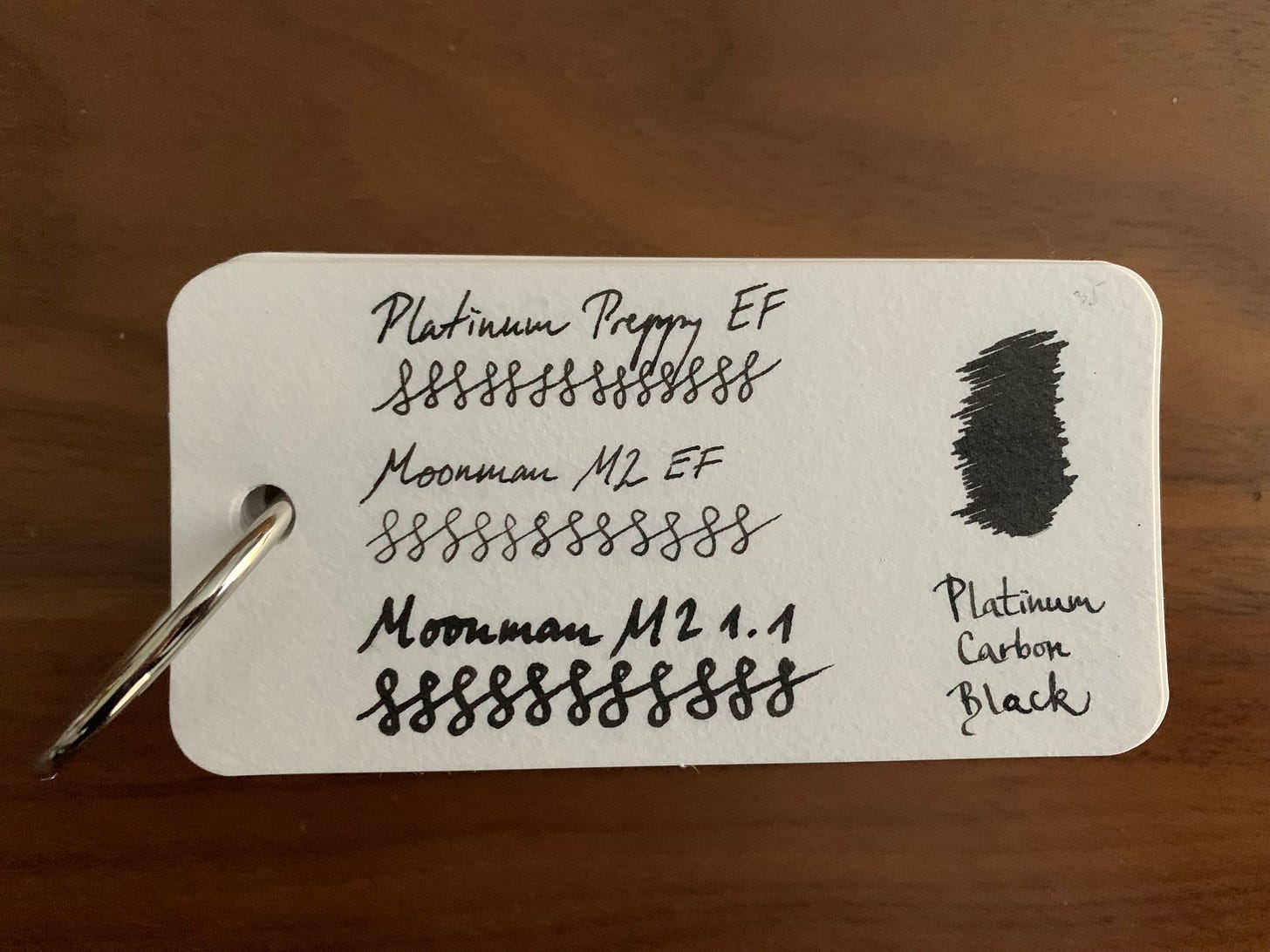
Writing sample and the swatch on the Col-o-ring. It’s so dark and velvety. Yum.
Blue Black: Lamy Blue Black
I really thought I was going to say Pelikan Blue Black, but nowadays it’s kinda hard to find it and, I admit, it varies too much from batch to batch. I’m sure Nathan Tardiff doesn’t oversee these but still. I’ve seen people complain how it’s grey on the page for them (valid) and it can look slightly dull. PBB has a slight iron gall component to it, and for a long while, it was banned in the US, so naturally, I would stock up when visiting home.
However, I tried Lamy Blue Black once and… I’m hooked. I don’t have a bottle of it, and in fact, I just used my last cartridge, but it’s a rich, dark blue with a tinge of black, and it’s not waterproof, but why would you need that when you can have an excellent ink for cheap?
Side note: Pilot Blue Black looks just blue and it’s boring. Literally looks so dull and silly on the page that I often wonder how I’ll ever be able to get rid of the 11.5 cartridges I have left. Let me know if you want whatever I have left. I’ll send it to ya if you cover shipping.
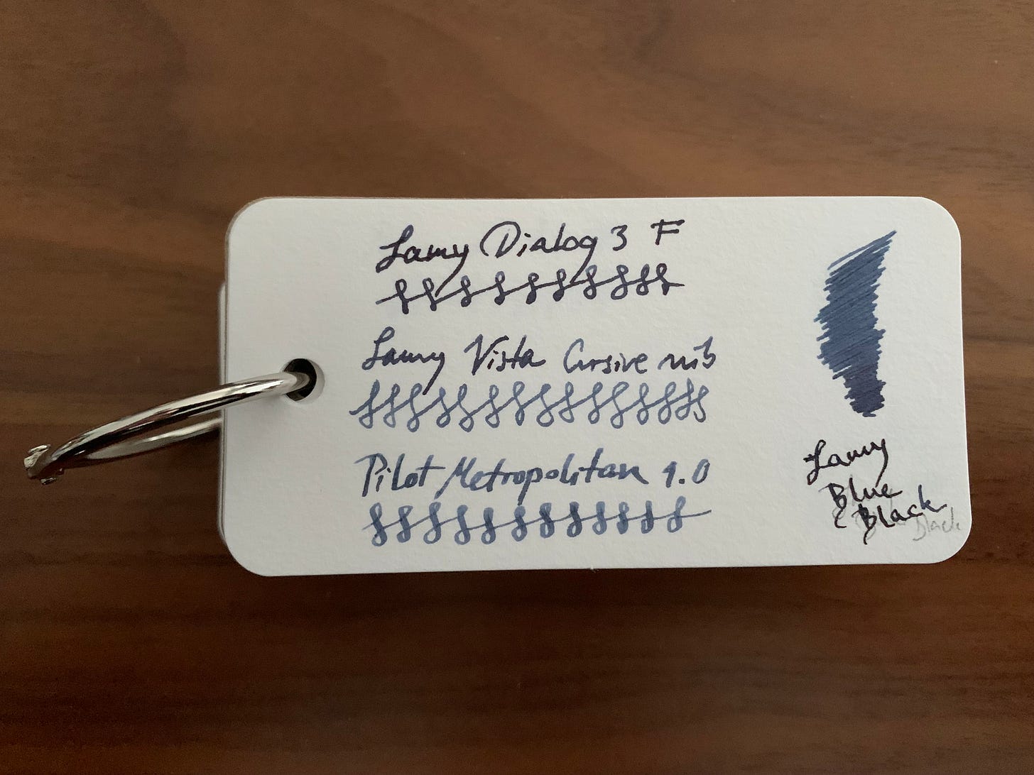
Writing sample and the swatch on the Col-o-ring. Lookit how lovely. The D3 is a wet nib, but honestly, even in a drier pen (Metro 1.0 stub), it looks awesome.
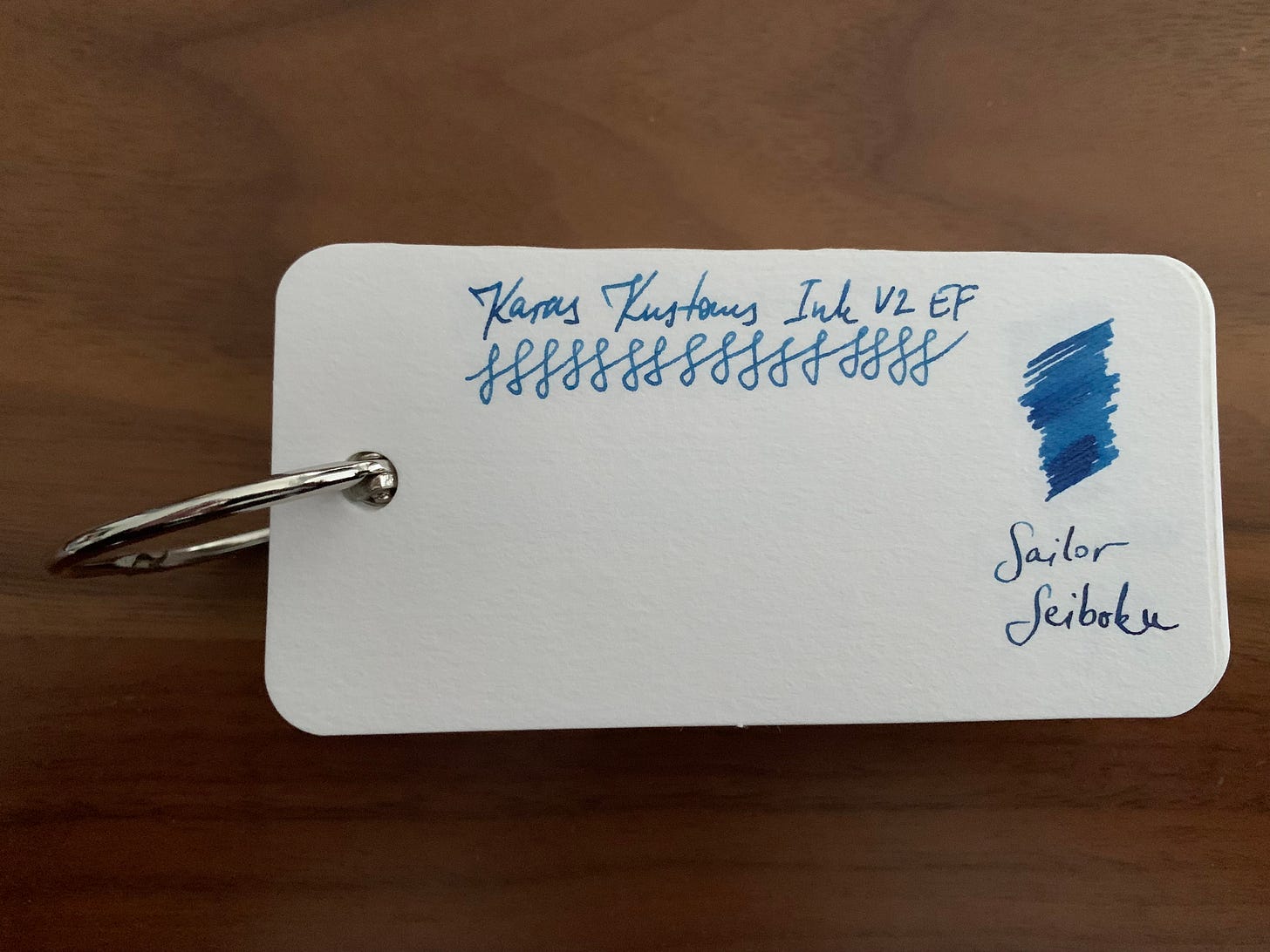
Blue: Sei-boku vs Kon-peki i.e. a toss up between permanence and beauty
Very very very hard question. On one hand, I love me some semblance of permanence and I kid you not, I was able to get a bottle of Sailor Sei-boku from my employer because I live in the first part of the 20th century and it’s perfectly reasonable to ask for fountain pen ink as a part of necessary office supplies. Sei-boku gave me that tactile feeling on the page (much like Carbon Black), as well as permanence. Just don’t leave it in a pen forever, especially in a pen that tends to dry out, and you should be fine. Otherwise, it’s a pain to clean. Toothbrushes help though.
Writing sample and the swatch on the Col-o-ring. Yes, I only swatched one nib. Haven’t had the chance since I spent too much time admiring it in the EF.
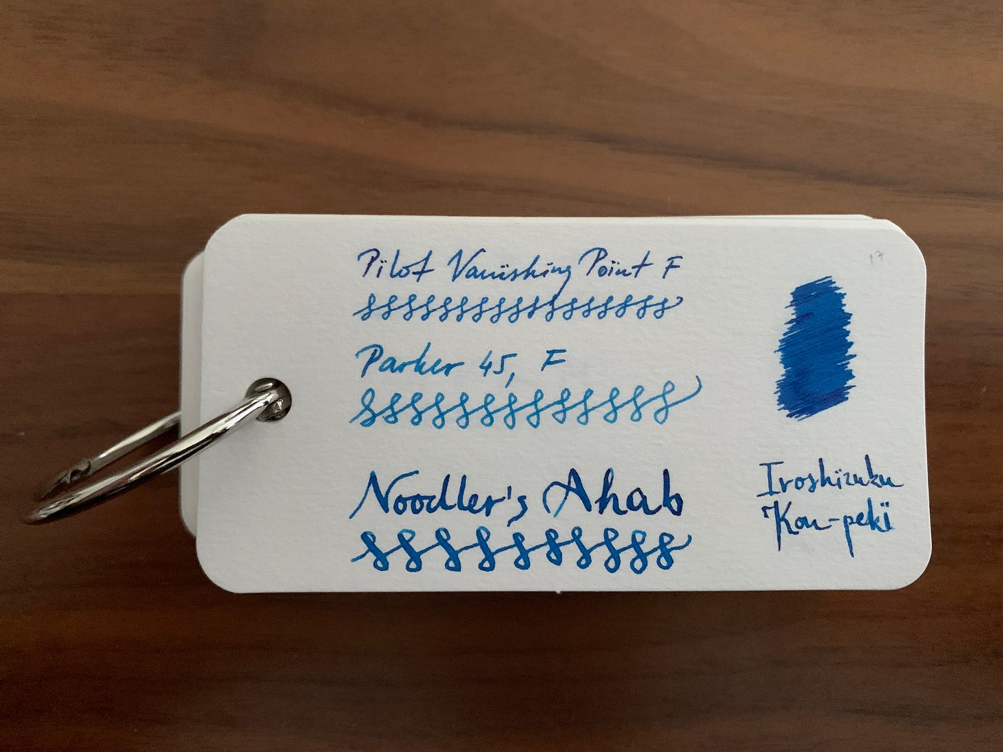
Iroshizuku Kon-peki is probably the most universally loved blue. It’s lauded left and right, it’s recommended to everyone, it’s used by anyone who’s ever used a fountain pen2 and their grandmother, and it looks glorious in most pens and on most papers. The downside is that it has no water resistance and it stains counters and gosh it’s so hard to clean off porcelain3. Or maybe it’s just me and the fact I use it in my Vanishing Points.
Writing sample and the swatch on the Col-o-ring. See, I wasn’t sold at first. Blue is blue is blue, right? But it grew on me, and then it actually stayed on me and also my counters.
Honorable mention to Diamine Oxford Blue just because it’s a perfect dark blue ink and gosh do I love it. You’ll say “But,
, that ink doesn’t even look anything like Kon-peki, why is it in the same category?” — and you’ll be right. It’s here because it’s good looking but I cannot write a novel about blue inks now, can I? But you should try it.Teal: KWZ Baltic Memories
Another disclaimer: what one man thinks of as teal is another man’s blue/turquoise/green.
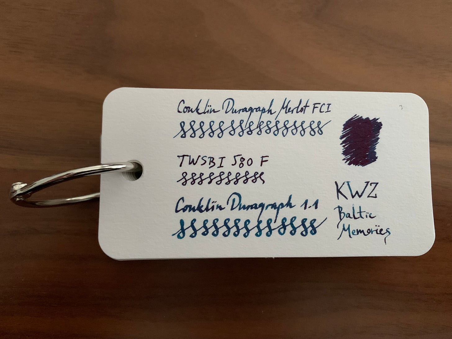
For me, teal is a broader category. Enter KWZ Baltic Memories, a beautiful, shifty ink that looks like a puddle of gasoline if, you know, you looked at it in a dark parking lot. And if that parking lot smelled like a bakery. Maybe the parking lot in front of a bakery? Or patisserie? It’s a rich, saturated ink that sheens red and smells like vanilla!
Again no waterproof qualities, but bonus points for the fact that after you clean your pen, it will still smell like vanilla. I kid you not. I sniffed. My nose is teal. And the ink is not even labeled as a scented ink.
Writing sample and the swatch on the Col-o-ring. Looking forward to the comments on how this is not a teal, and I kinda agree, which means someone on the internet lied. And that’s never happened before.
Blurple: Kyo-no-Oto Soft Snow of Ohara
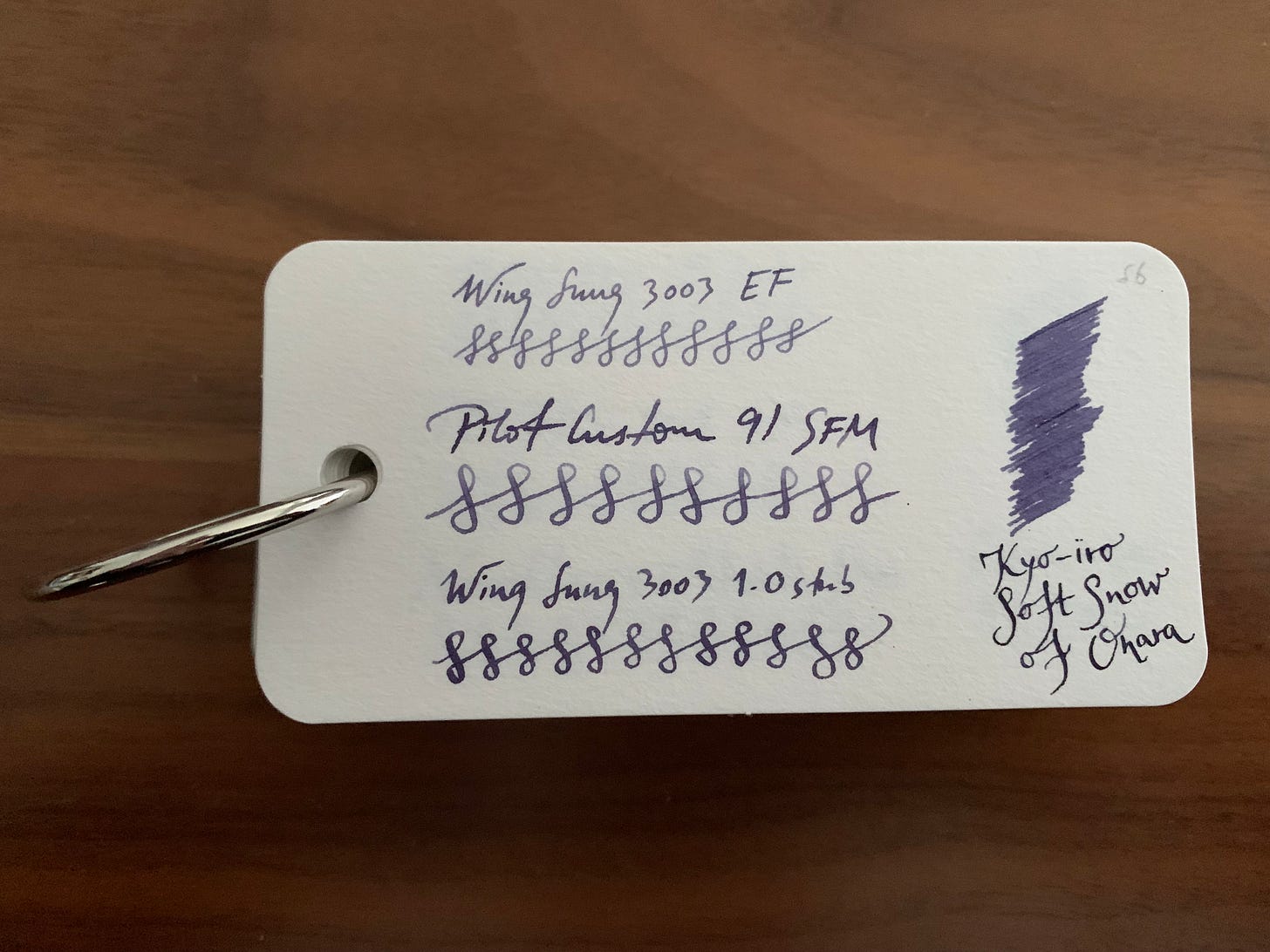
This ink is truly one of the most pleasing inks I own. It makes me calm. There is nothing I don’t like about it. I mean, it started the whole post (if you still remember). If I had to pick three inks to write with until the day I die, this would take the first place immediately. It’s not waterproof, it’s not permanent, it’s not cheap, but damn, is it not divine? It feels like you’re in a Disney movie but one of them old ones where you cry your eyes out because the stupid hunters shot the fawn’s mom.
And now you’re crying too.
Writing sample and the swatch on the Col-o-ring. Thank you Martin. I know you’ll never see this but thank you.
Green: none
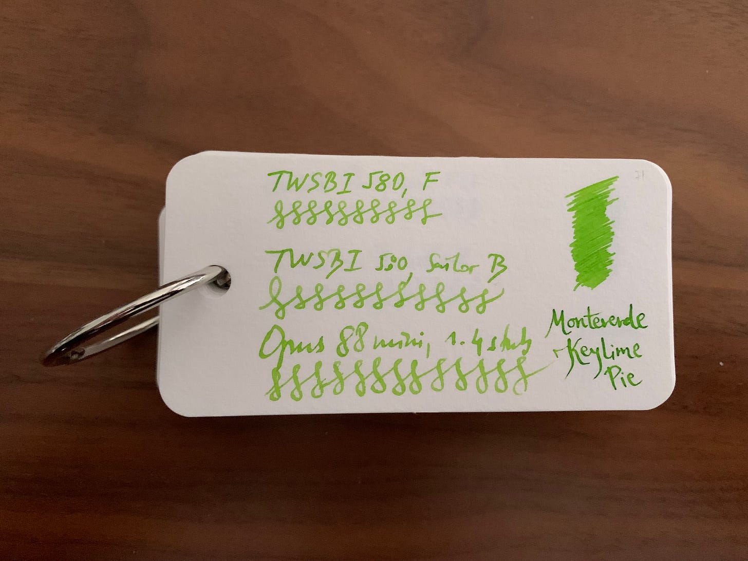
I hate green inks. Just hate them. I tolerate light green inks so I guess I’ll say Monteverde Key Lime Pie just because the sticker on the bottle is super cool and I live in Florida so of course I have to mention a fancy desert even though I hate sweets.
But if you really have to know which inks do look good on the page, check out Monarca Nopal. For a green ink, it’s quite nice and has character, and it pairs well with Diplomat Elox Matrix. It’s quite sad that it’s not talked about often. Honorable mention to Monteverde Yosemite Green for the same reasons. And Rohrer & Klingner Alt-Goldgrün. For the lighter ones, which are similar to Keylime Pie, Akkerman Hofkwartier Grun also comes to mind. Oh and Diamine Meadow. I sadly have no bottles of any of them except R&K, so I can’t talk about them, but from what I can tell, I’d say they’re pretty nice greens.
Oh.
Fine. Maybe there are some nice green inks, but I refuse to change the subtitle.
Writing sample and the swatch on the Col-o-ring. POPS off the page, doesn’t it?
Brown: Lie de Thé
Does anyone actually like brown inks? Except Drew Brown from Goulet Pens? I mean sure, they do look good if you’re looking for the “antique” look in your traveler’s notebook spread, but they can seem a tad boring. I know most people would recommend something like Noodler’s Brown (not me though) or Diamine Chocolate Brown, or even Ancient Copper, although that one might be too light to be called true brown.
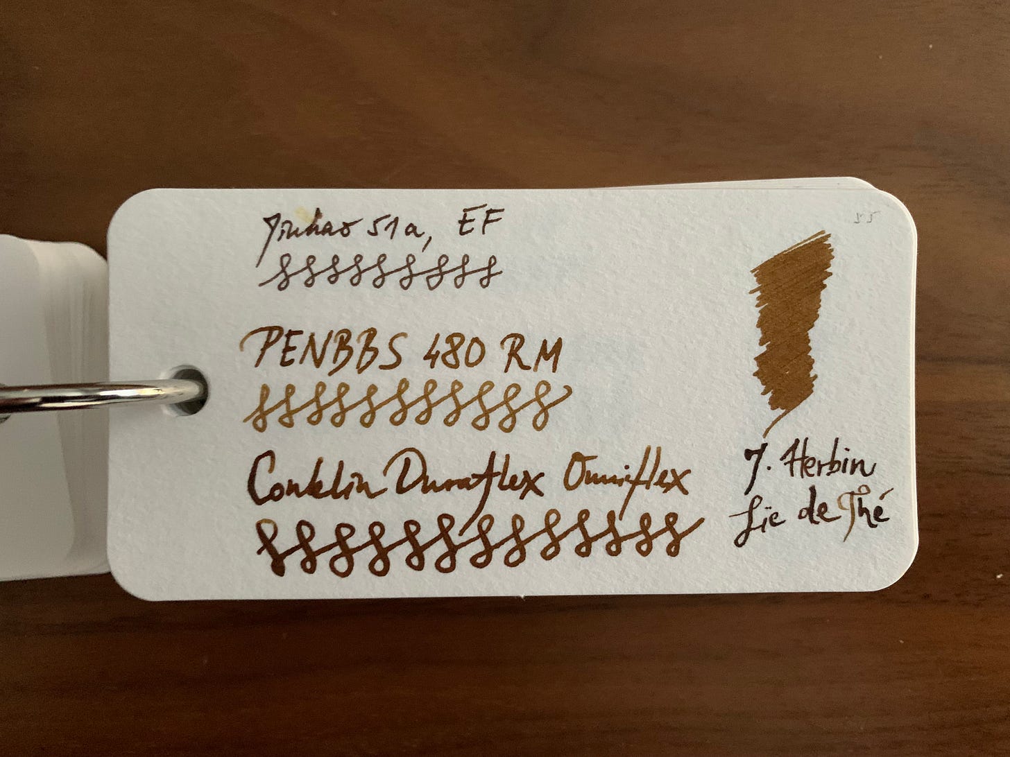
Instead, let’s go with Brian Goulet’s most hated ink, i.e. Pelikan Brilliant Brown (“How can brown be brilliant”, he’d say) or — J. Herbin Lie de Thé. The latter is just pleasant to look at. No permanence but man does it look nice! Even shades a bit.
Honorable mention to Birmingham Pens Burlywood. The reason I didn’t include it as the top brown is the fact I haven’t yet had the time to play with it for a bit, as I got it fairly recently, but when you clean it out of your converter, the water turns NEON YELLOW WOOOOO!
Writing sample and the swatch on the Col-o-ring. Again, does anyone really like browns? Try Burlywood, honestly.
Red: Diamine Red Dragon
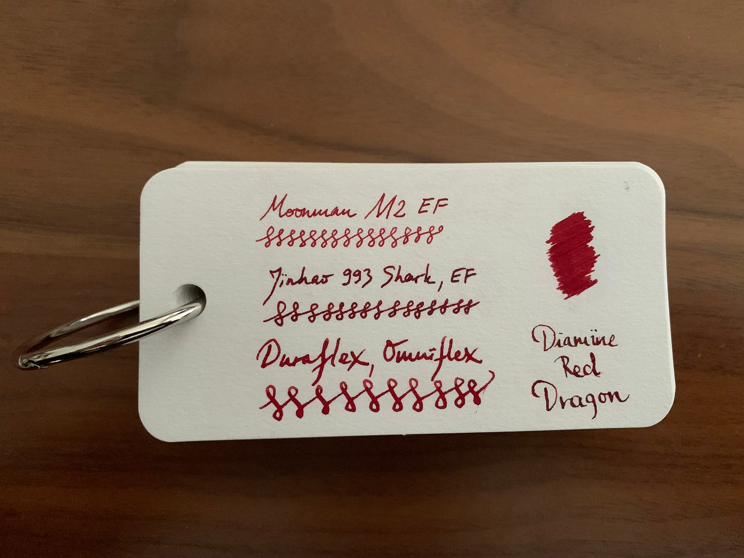
Wow another disclaimer. Sorry. Not a fan of reds just because they lack character and because all of my teachers used red pens to cross out redundant and repetitive words and run on sentences in my essays (see what I did there?). There is, of course, more than one red out there that (probably) looks good, but I am very old school when it comes to reds, so my red of choice would be the OG of modern reds: Red Dragon. I haven’t tried Matador, but I’ve tried other reds and honestly, this one just looks like red should look. Not like someone who’s only seen school buildings thinks like they should look (I’m looking at you, Pelikan ‘Brilliant’ Red, or should I say… Pelikan Dull and Super Pale Ew Orangeish).
Writing sample and the swatch on the Col-o-ring
Yellow/orange: Pennonia Dungo
You thought I’d say Apache/Southwest Sunset, didn’t you. Nope.
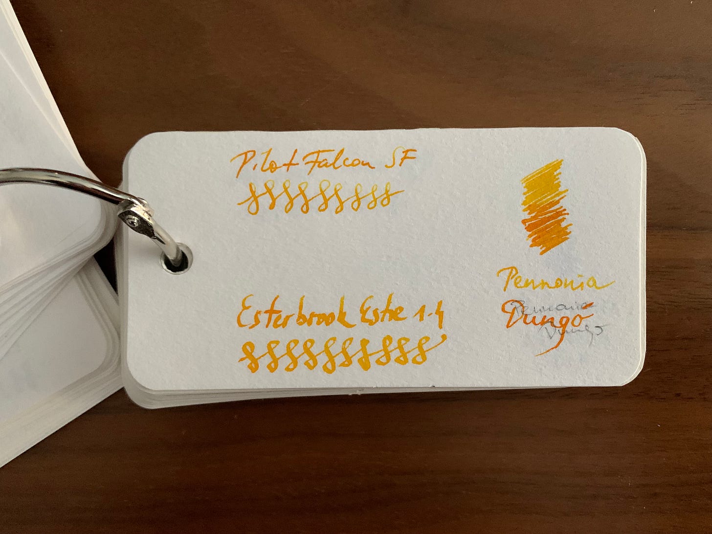
Well, I found that Pennonia’s Dungo looks quite similar, flows well, and doesn’t take forever to dry. Plus, I have to support a fellow European maker, especially one who is super cool and responsive. The bottles are minimalist, the price is good, and this ink in particular shades super well while remaining legible even at its lightest.
Generally speaking, yellow inks are hard on the eyes, so I personally cannot say that I care much about them, but I do like the Van Dieman’s Yellow Goldfinch Yellow (yes… that’s the name), albeit I cannot use it for a long time as it hurts my formerly bespectacled eyes.
Writing sample and the swatch on the Col-o-ring. I don’t like oranges, so this is my perfect in-between shade of yellow and orange together.
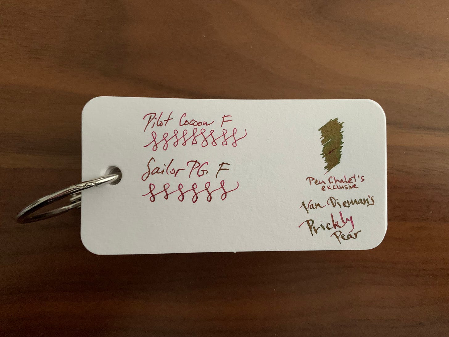
Maroon: Pen Chalet’s exclusive Van Dieman’s Prickly Pear
And that’s a wrap. Literally the most amazing little sheening ink ever. Hands down. The perfect maroon that sheens greenish in a Japanese fine nib? Sign me right the heck up. This is yet another one of those inks I only saw a photo of before I slapped it in the cart and checked out and fell in love at first write. Absolutely mind-bogglingly beautiful. Naturally, it was a limited edition and they will not restock it (I asked), which means you probably won’t be able to try it, and I am sorry for your loss. If they do make it again, all I want is to become the spokesperson for it. I’m not ambitious enough to go for the title of spokesperson for the entire line, but the ink… yes please.
Writing sample and the swatch on the Col-o-ring. That. Sheen. Sheesh.
Conclusion
Did I need to toss in a haphazard slew of inks in one blog post? Probably not. There has to be a cut off though, and apart from the green, I went with inks that I am more likely than not going to lean towards. I have always thought I didn’t much care about blues, and yet, I have several shades of blue that I absolutely cannot pick from. Top three inks that surprised me, you ask? I might as well say four will probably be blues.
Question for the fans: is there anyone out there who knows a dupe of the Prickly Pear? Drop me a comment.
What are your favorite inks? How wrong am I in my picks? Let me know.
Also, consider subscribing/pledging; it’s not mandatory, but it helps.
Link because I finally figured out how to use this feature: https://mountainofink.com
I absolutely have 0 data on this but indulge me.
My wife cannot know about this so send help after this post comes out.



Oxford Blue and Sei-boku are both absolute stunners! Fell in love with Sei-boku after buying a few cartridge-only Sailor vintage pocket pens.
I ADORE green inks though, and there are so many good ones!! Colorverse Crab Nebula, Faber Castell Moss Green, KWZ Pine Green...
Tsk tsk. Green is definitely the greatest color. Lol
Funny you mention BPC Burlywood. I have that inked right now and I love it!